Logo design
Conceptual logos for various sectors
//Overview
Services
– Branding
– Logo design
Below is a curated selection of logo designs developed for a diverse range of industries. The collection showcases each concept in both full colour and monochrome variations, highlighting the versatility of the designs across different brand applications.
A brief description accompanies each logo, outlining what it was created for and how it is intended to be used across different applications.
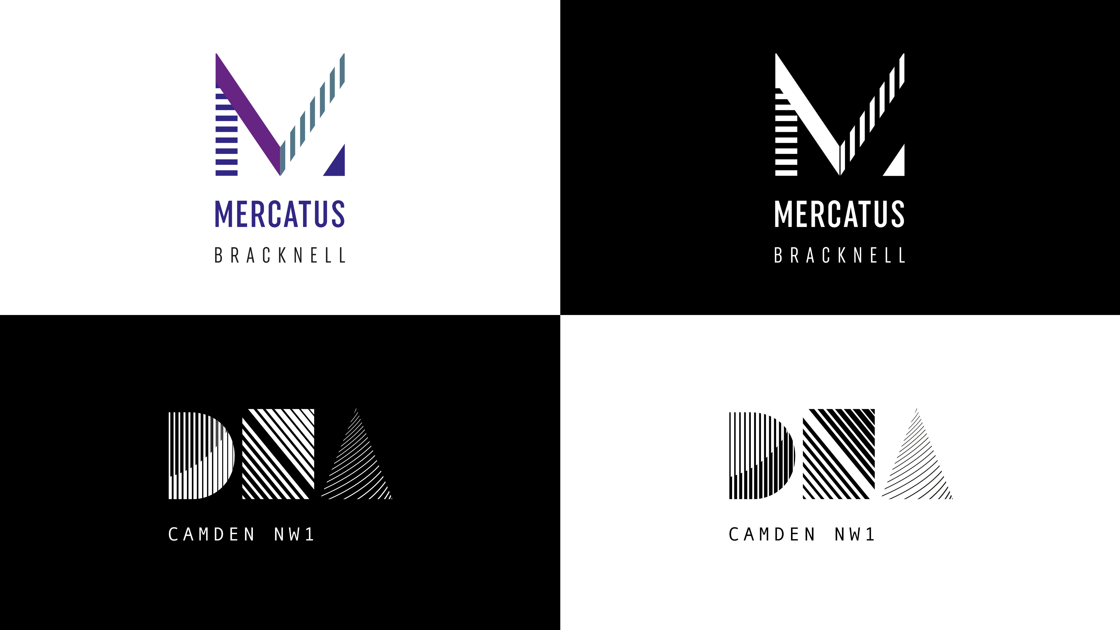
Mercatus
As part of the Bracknell town centre regeneration project, Mercatus is a co-working office development designed with modern amenities. The brief called for a contemporary logo that aligned seamlessly with the interior colour palette and reflected the space’s forward-thinking, professional environment.
DNA Camden
DNA is a contemporary residential development created for young professionals seeking to live in a lively and well-connected area of London. The logo adopts a modern visual style, using elements inspired by fingerprint patterns and DNA strands. This idea highlights themes of individuality, identity, and the distinctive nature of the development.
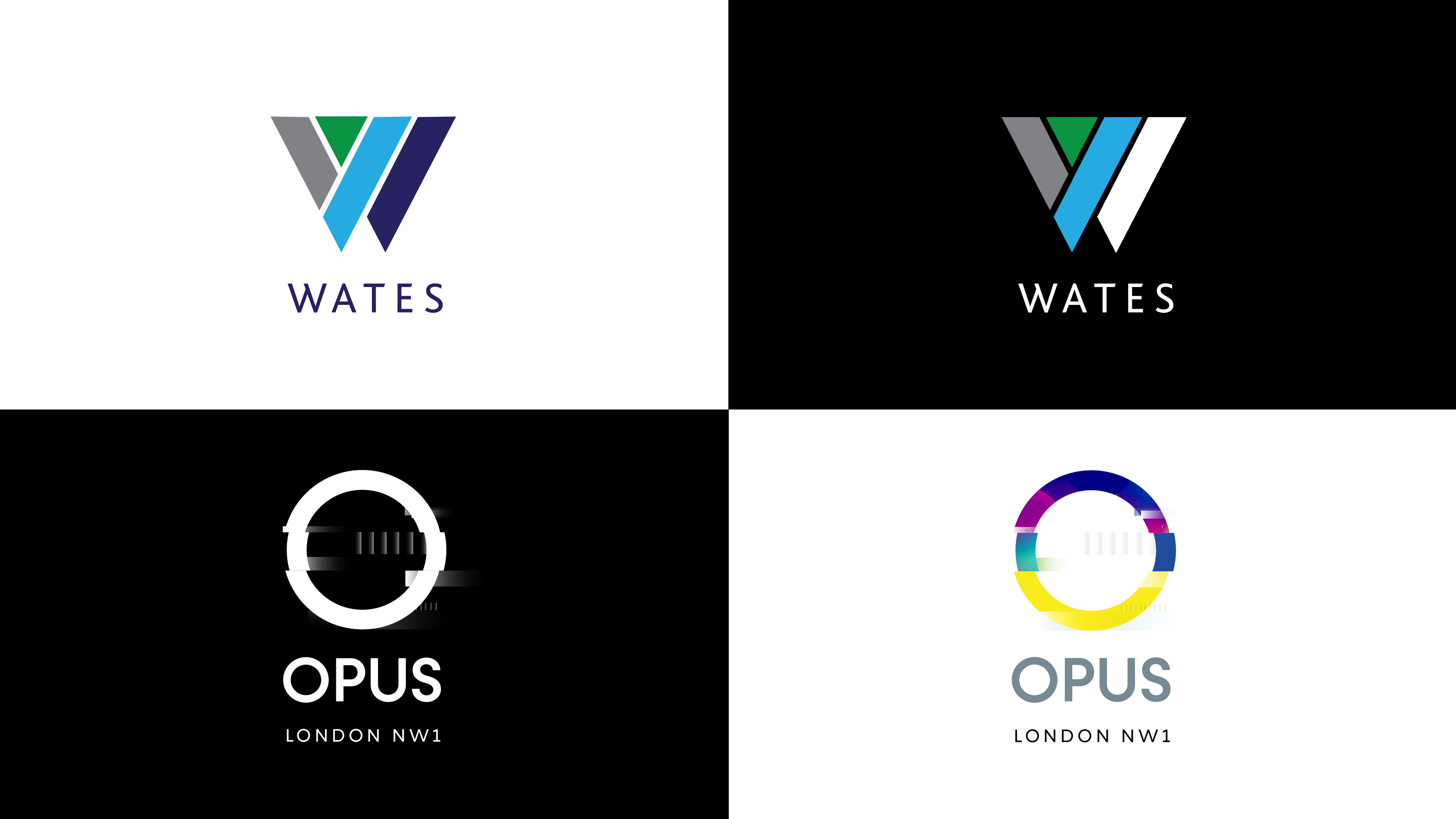
Wates
Wates is a company made up of divisions: Construction, Residential, Developments and Services. They required a refreshed identity that could be applied across the entire business. The concept uses a contemporary typeface and four distinct sections to form the ‘W’ in the Wates logo, with each representing one of the divisions. This design was one of the proposed routes presented during the rebrand process.
OPUS
Opus is a modern office development in North London aimed at media and technology companies. The logo was designed to reflect the world of digital media, drawing inspiration from moving image, screens and technology. Its visual style suggests motion and innovation, creating a contemporary identity suited to the creative industries.
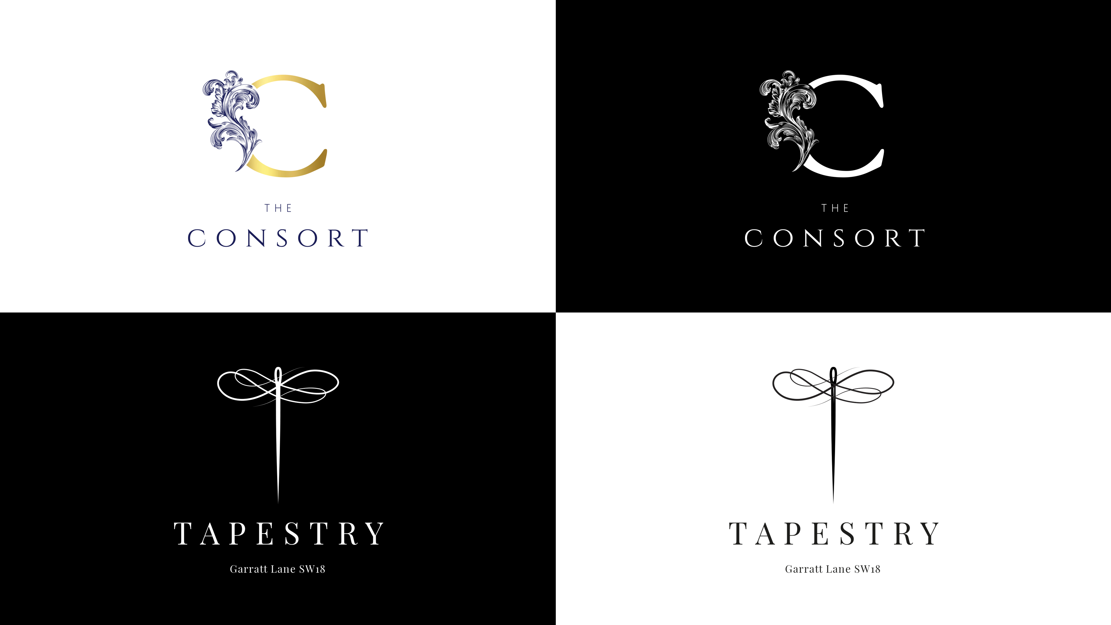
Consort
The Consort is a restaurant located in the leafy surroundings of Berkshire. They required a logo that conveyed a sense of quality to reflect their high-end dining experience. The design combines a contemporary interpretation of a classic typeface with a feather flourish, referencing royal heritage.
Tapestry
Garratt Lane in Wandsworth, South London, runs alongside the River Wandle and has long been central to the area’s rich industrial, particularly textile heritage. This history inspired the name of a premium residential development offering a range of one, two, and three-bedroom apartments. The logo was designed to convey a sense of luxury while blending classical elegance with a modern aesthetic.
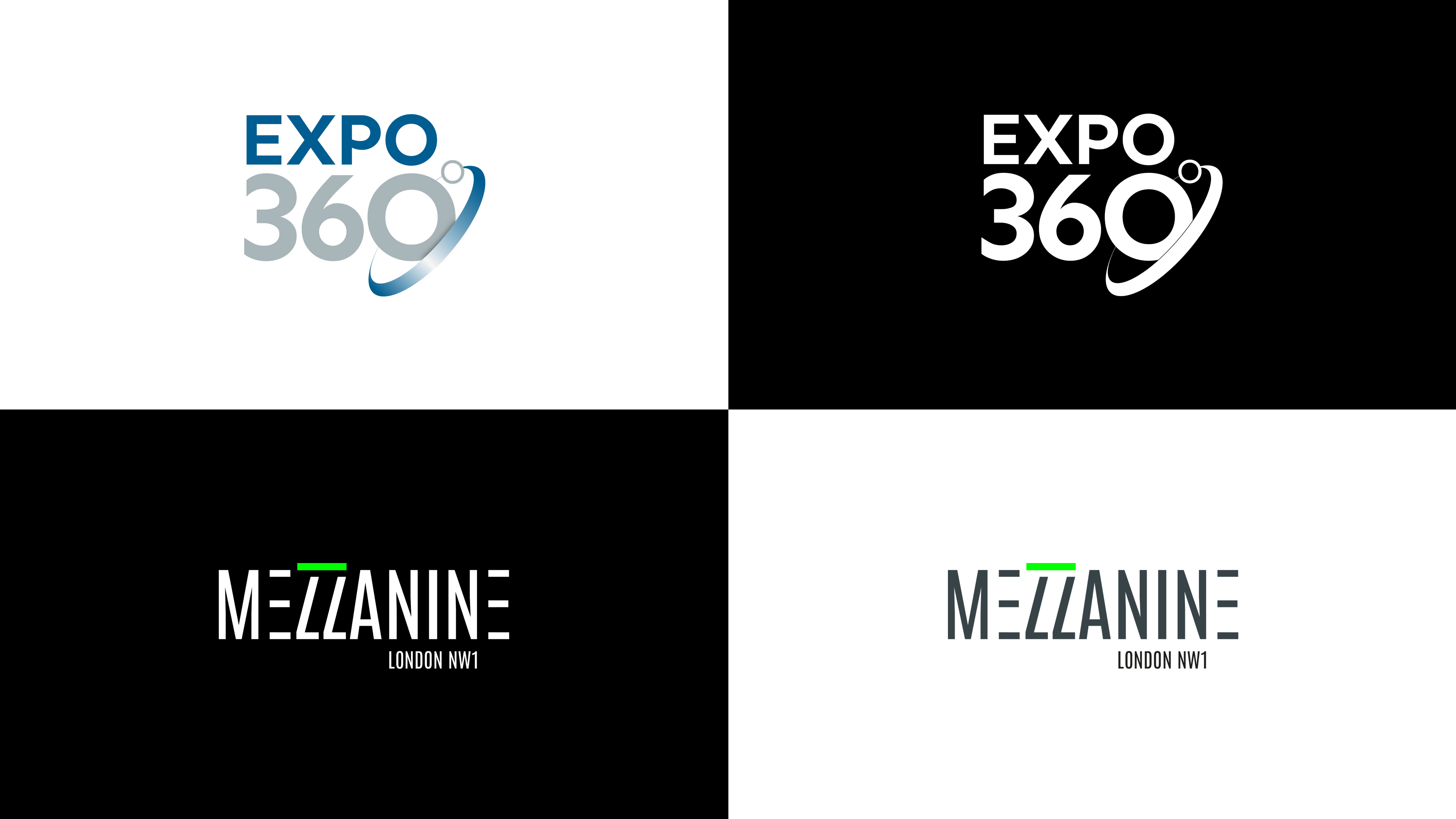
EXPO 360
Mezzanine
Mezzanine is an office development in North London where the mezzanine level is a key selling point of the space. The logo was designed using a modern typeface that subtly reflects this concept. The visual style was then applied across building signage and wayfinding.
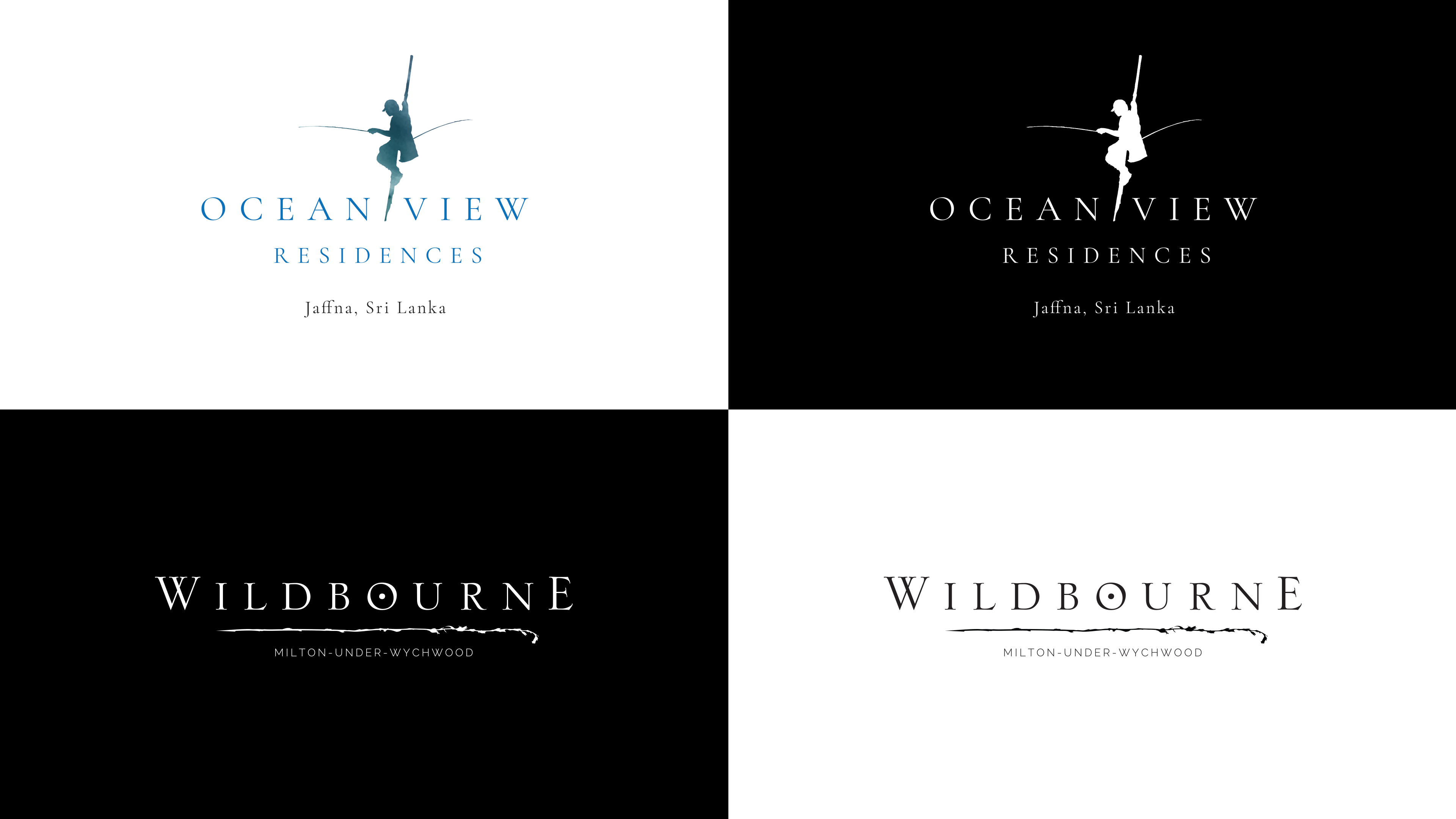
Ocean View
Ocean View is a residential development in Jaffna, Sri Lanka.
The logo needed to feel premium while referencing the area’s heritage, particularly the tradition of Sri Lanka’s stilt fishermen.
A fisherman silhouette was combined with aquamarine watercolours that blend into one another, creating a distinctive and elegant identity.
Wildbourne